Malt District Developement
Location: Cremorne, Melbourne
Project Credits: Caydon Properties
Project value: $1 Bil AUD
2019 - 2021
The Malt district development aimed to transform the historic Nylex site into a vibrant mixed-use precinct, featuring up to 1,000 new dwellings, commercial spaces, and the revitalization of the iconic Nylex Clock.
Set in the heart of Melbourne’s arts, entertainment, and sports precinct, The Malt District is redefining urban renewal—transforming a historic industrial site into a vibrant commercial and cultural hub. From morning to night, the district will pulse with energy as workers, residents, and visitors experience its dynamic mix of retail, hospitality, and creative spaces.
Project Brief
As part of this landmark transformation, I contributed to several key projects within The Malt District as part of Caydon’s in-house design team.
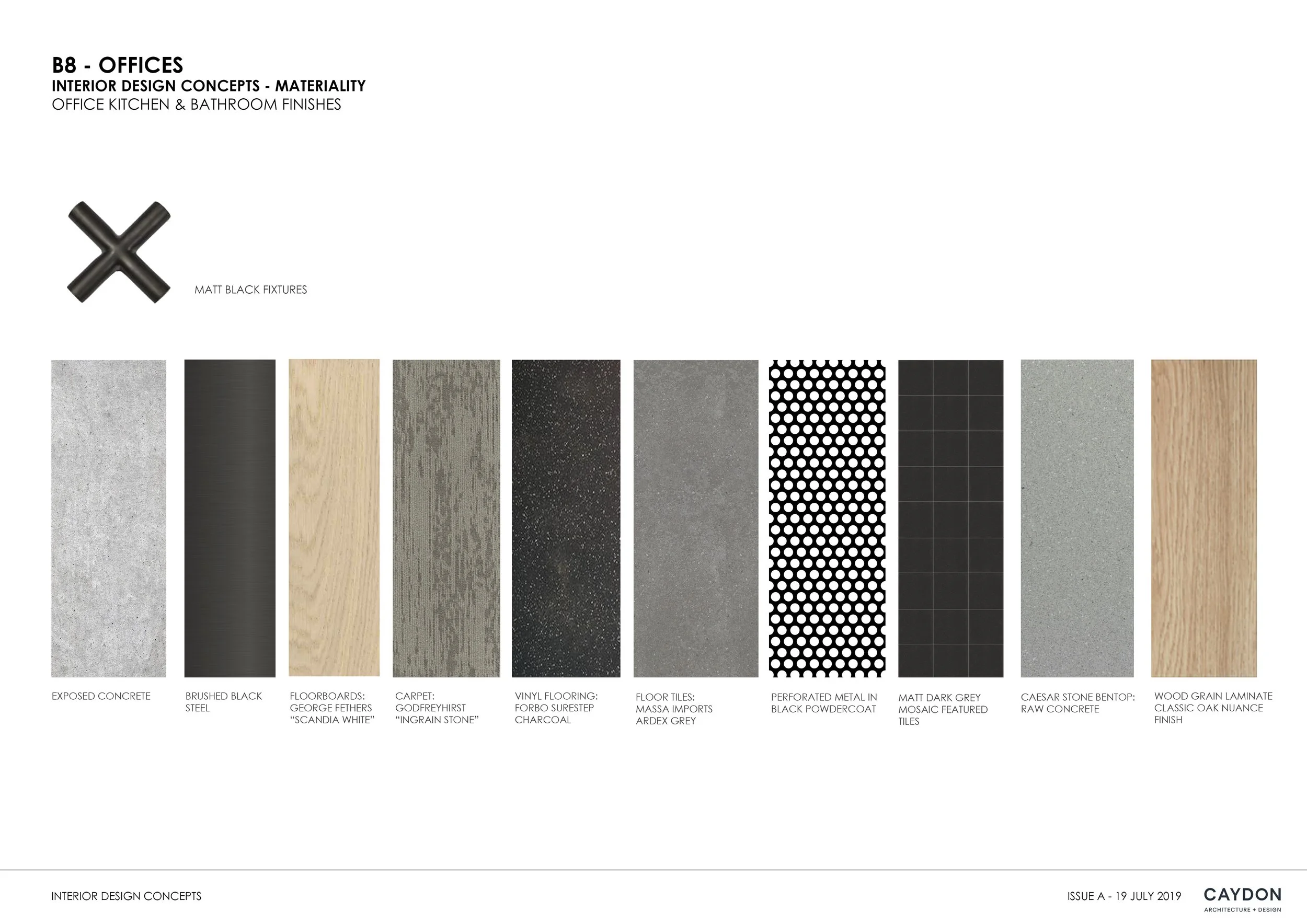
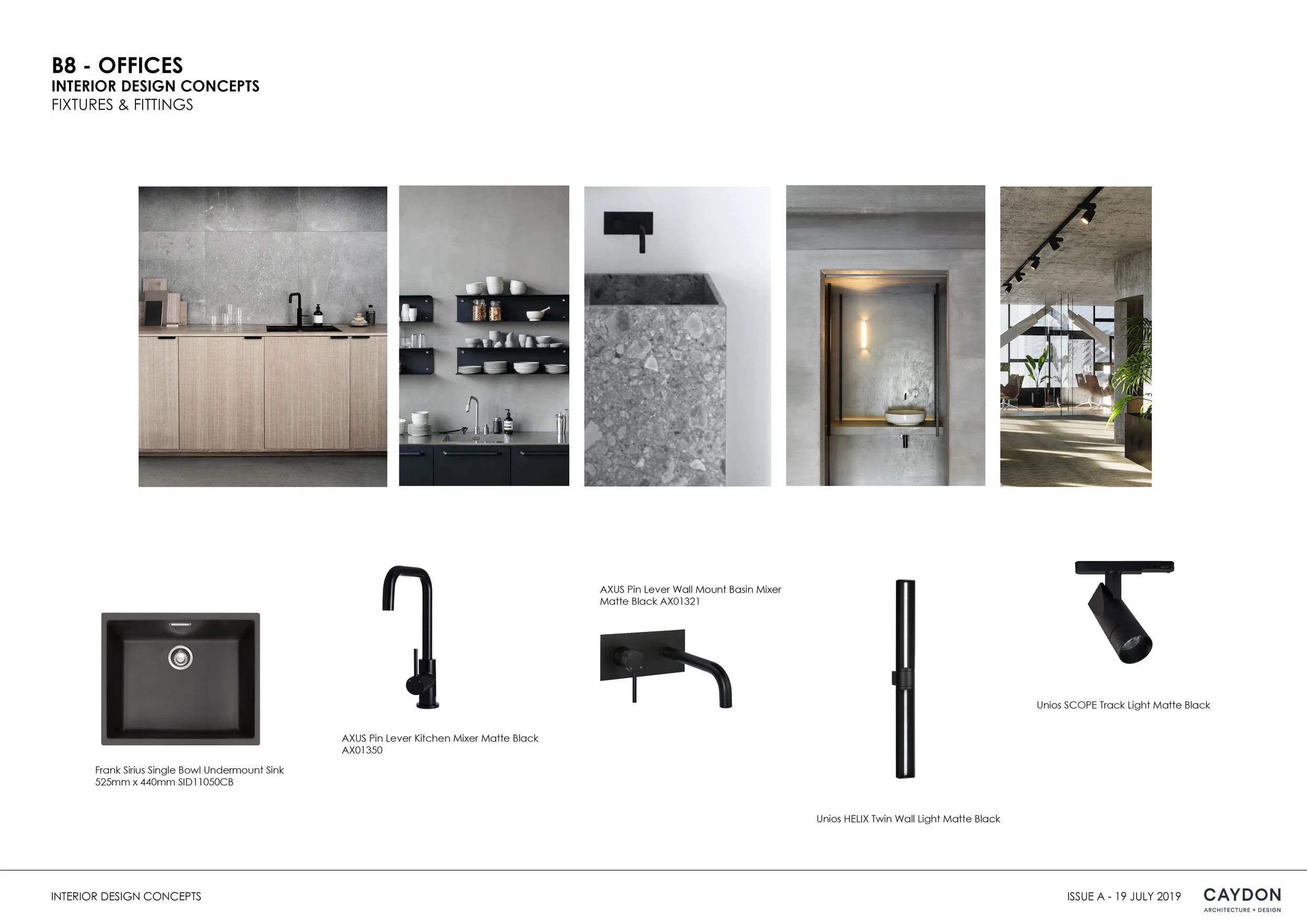
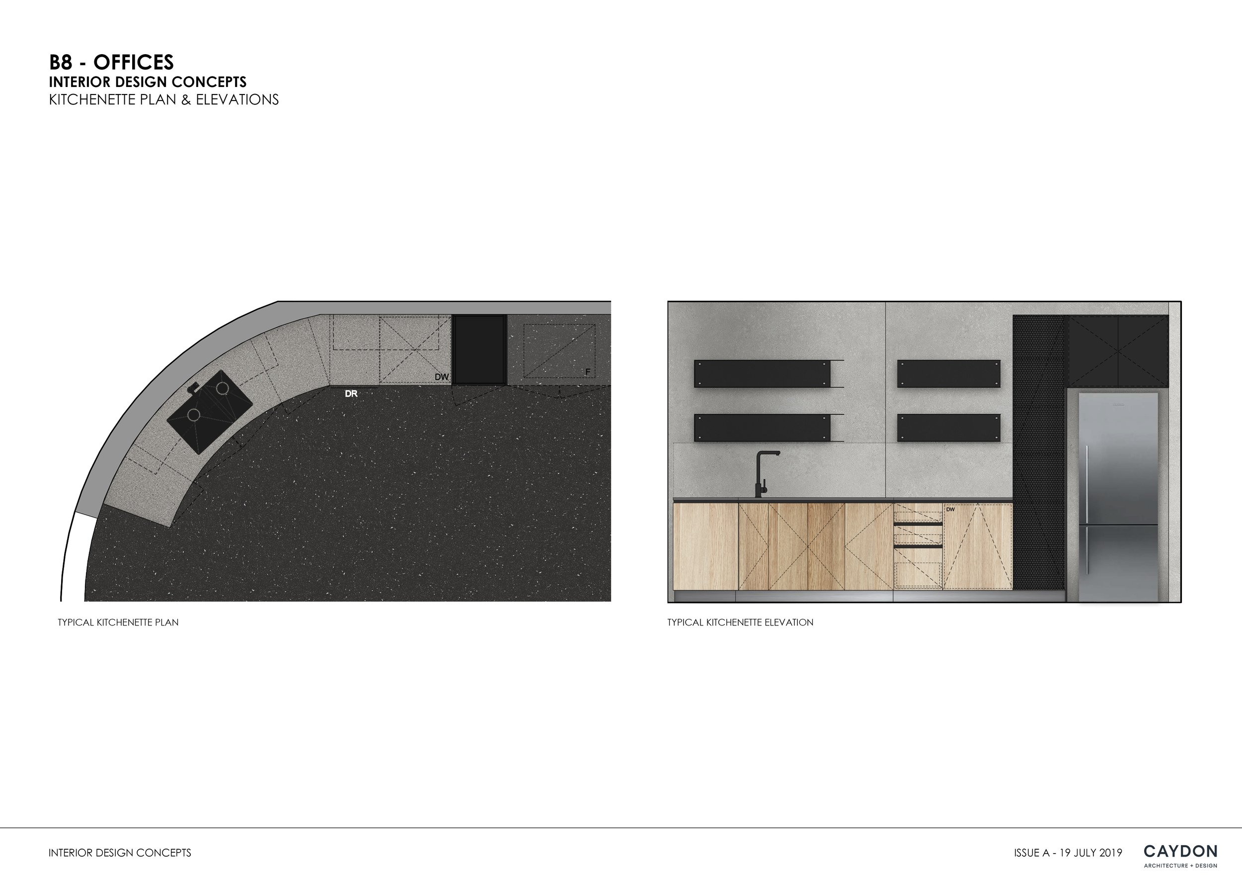
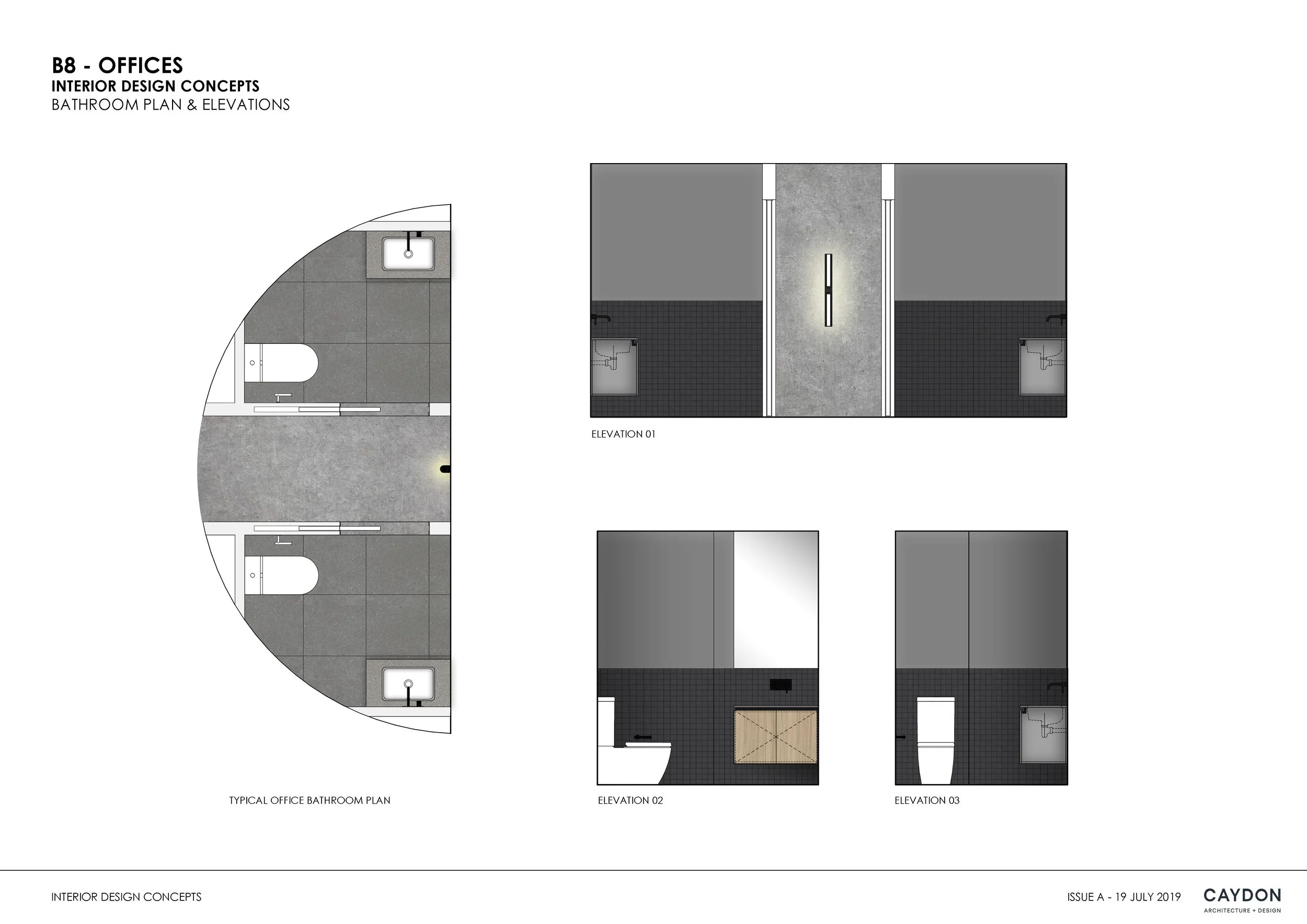
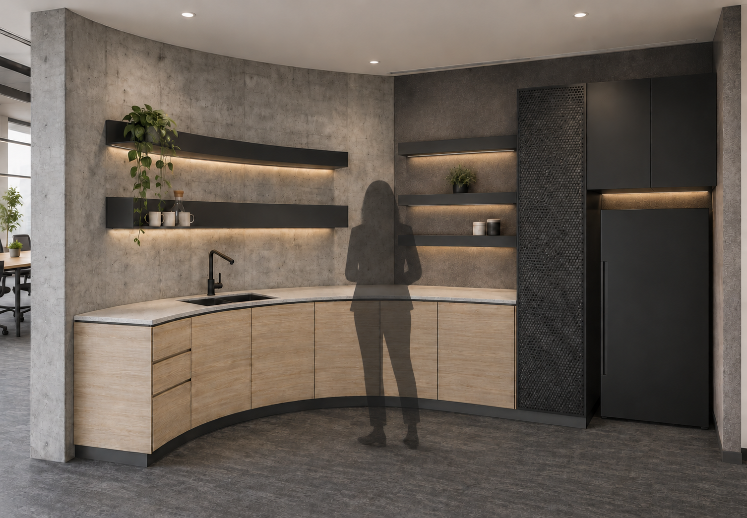
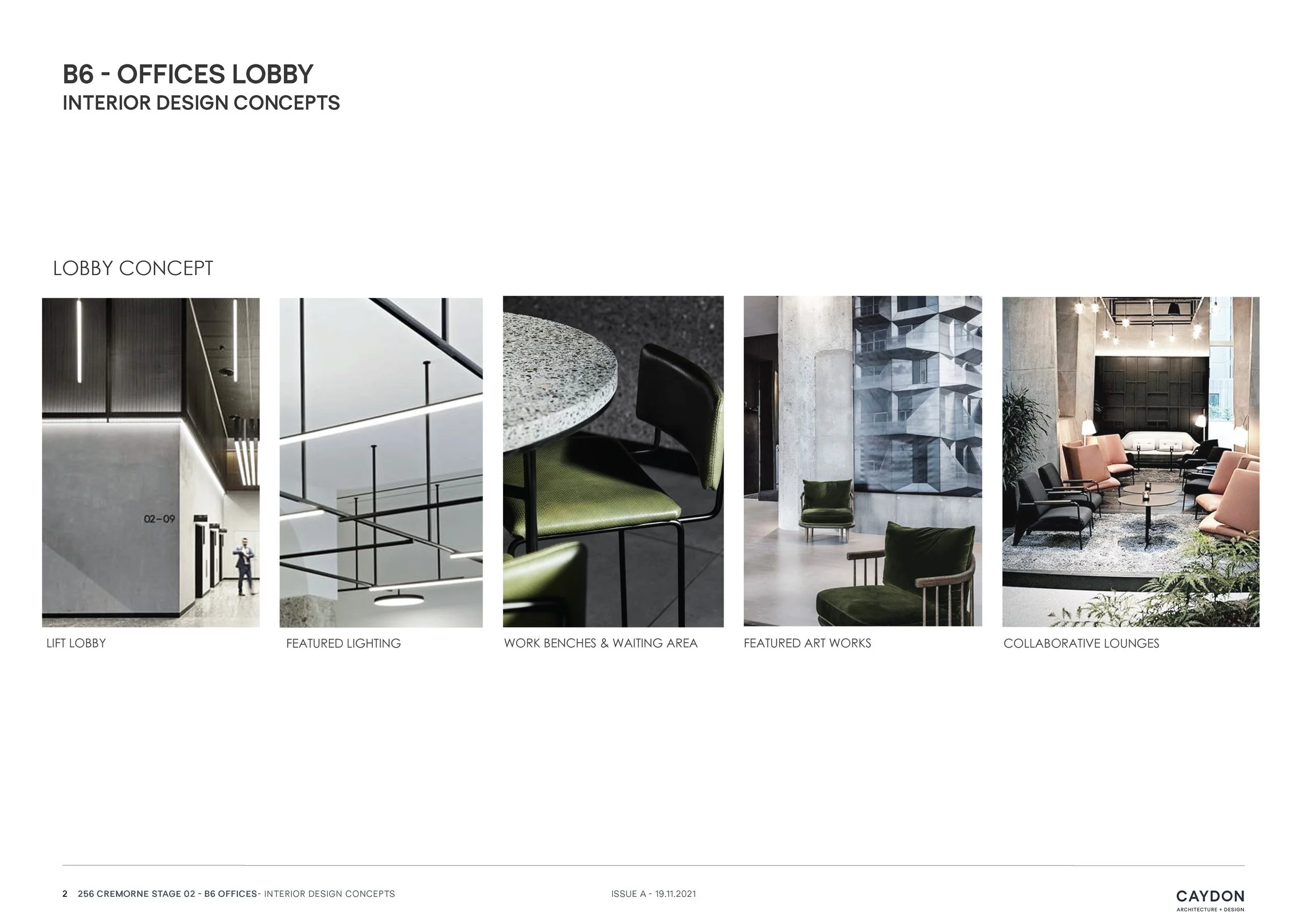
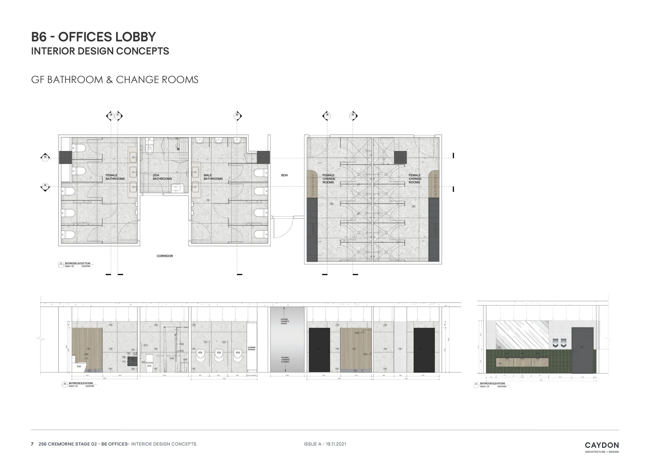
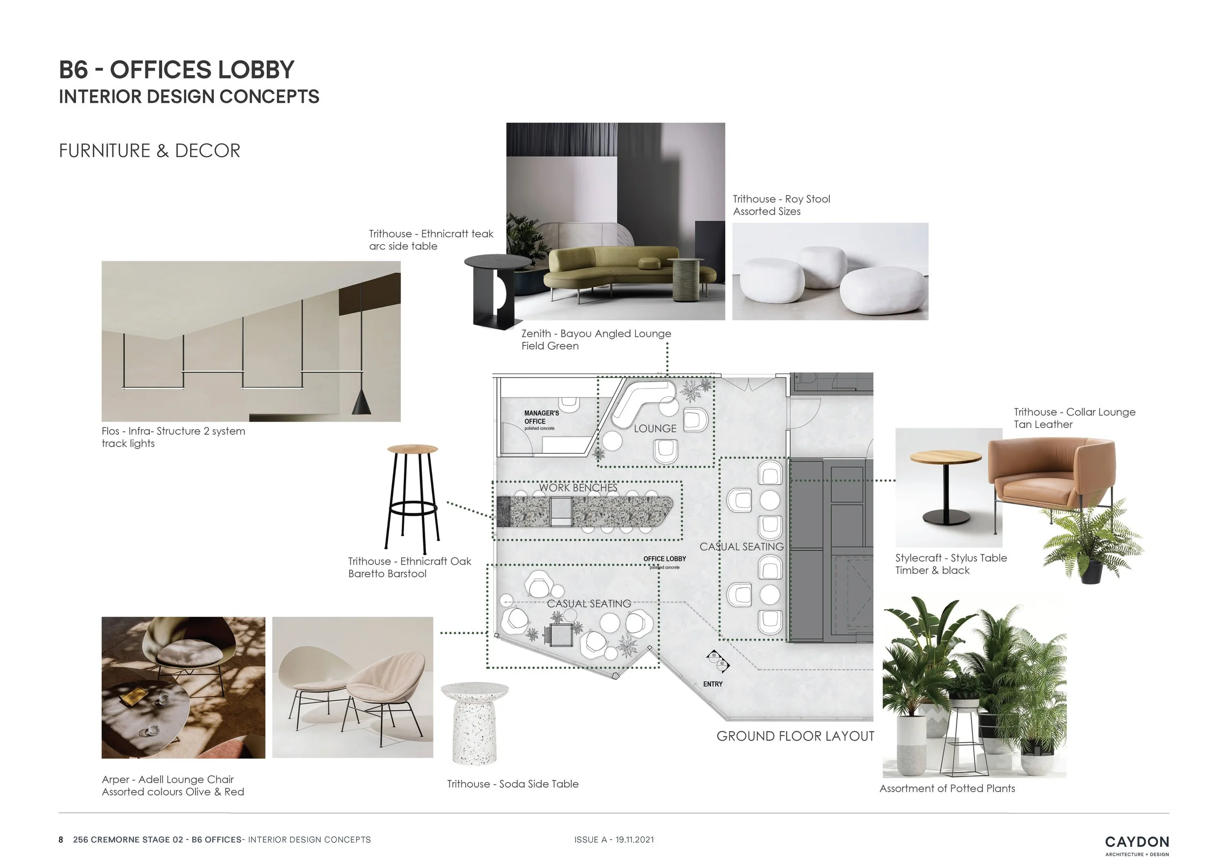
My role within this transformation included completing the concept designs for Coppins Corner Creative Soho offices, designing the amenities and signage for B8 offices, and crafting the lobby design for B8 Nylex offices. Additionally, I was responsible for the Coppins Corner apartment display showroom design and led the Design Development and Tender Documentation phase for the proposed 25hours Hotel.

Cremorne Malt District Site Plan
Coppins Corner Lobby & Offices (Building 5)
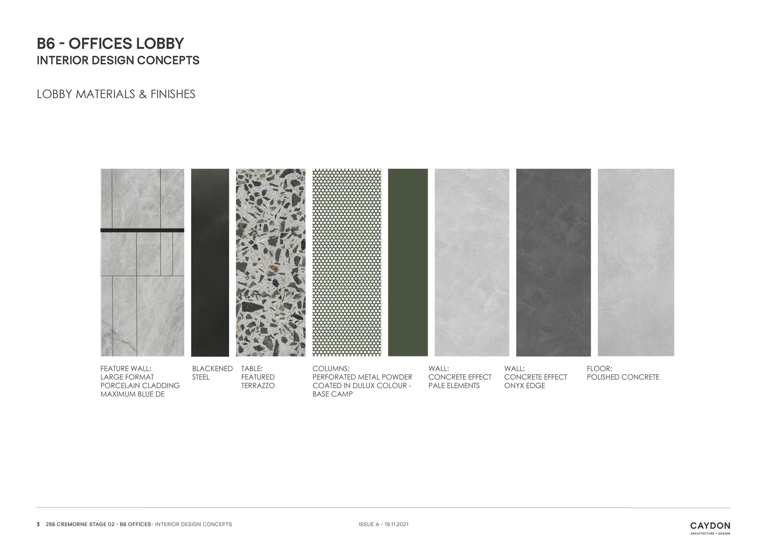
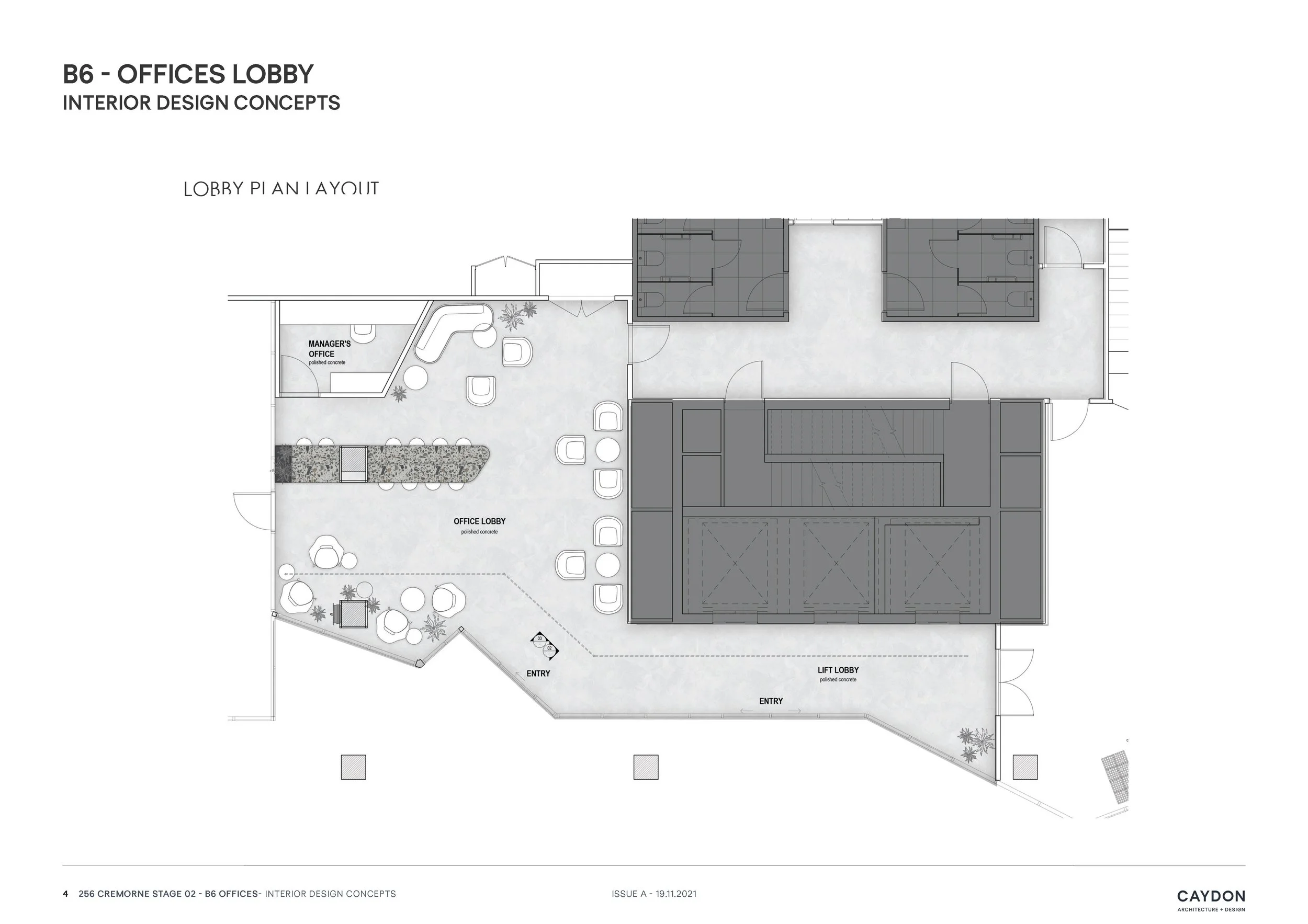
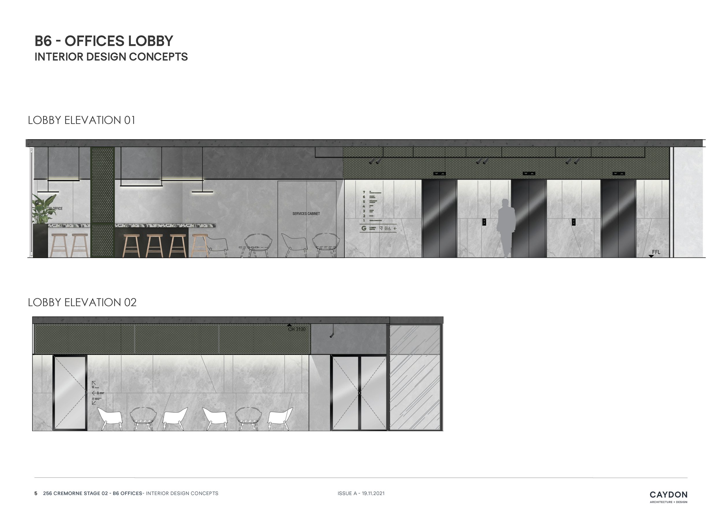
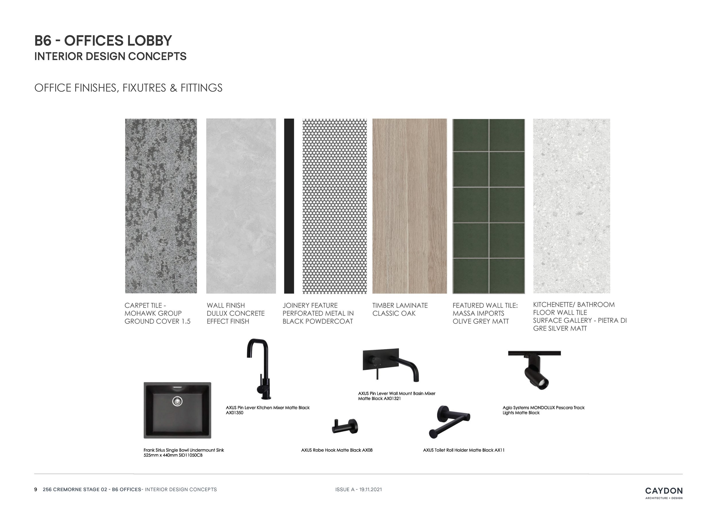
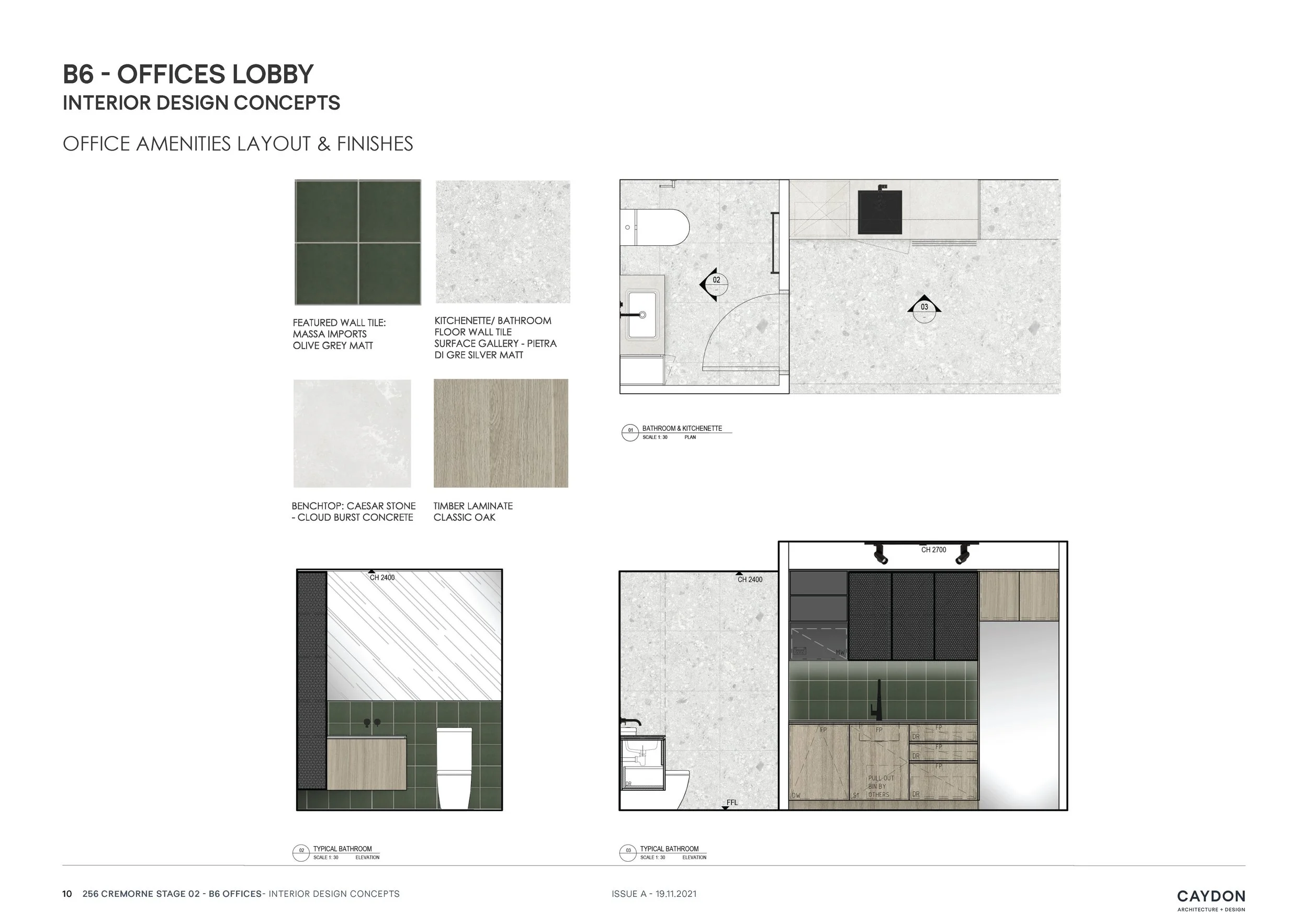
Coppins Corner was first envisioned as the 25hrs Boutique Hotel, a project that had a distinct character and narrative of an Victorian Garden Playground. As the brief evolved, the design shifted towards an office building, presenting an opportunity to reinterpret the original vision. To distinguish the building within the precinct, a garden green was woven into the colour palette. This deliberate choice softened the raw industrial aesthetic, adding a sense of warmth, vibrancy, and identity.
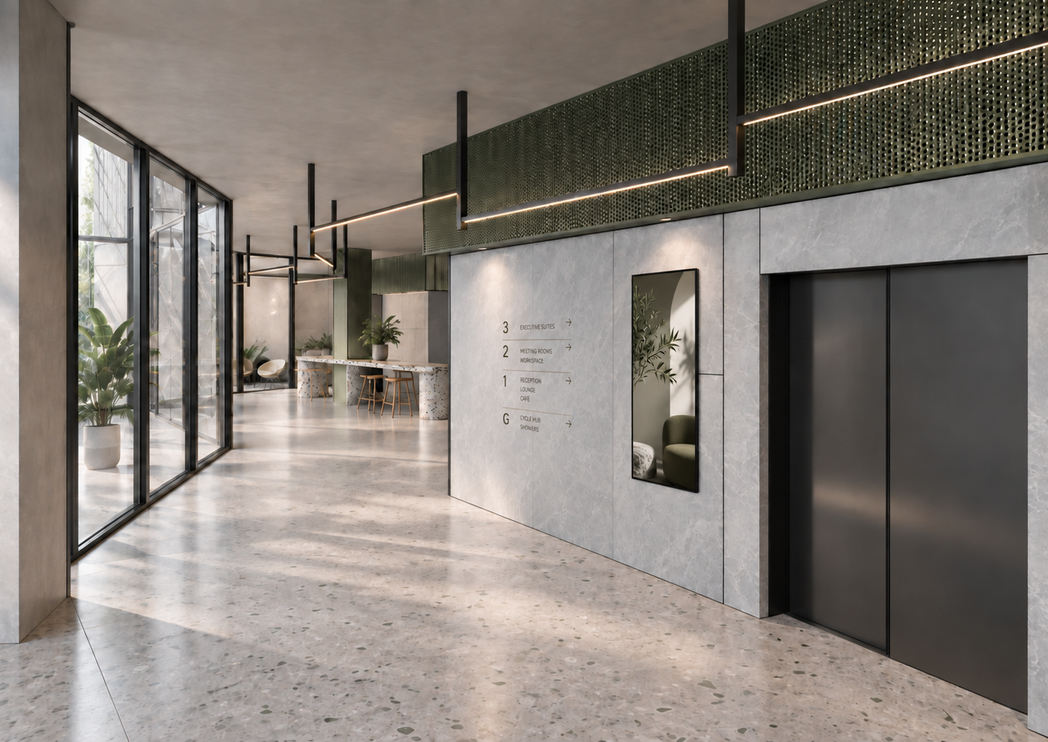
VB Silo Offices & Signage (Building 8)
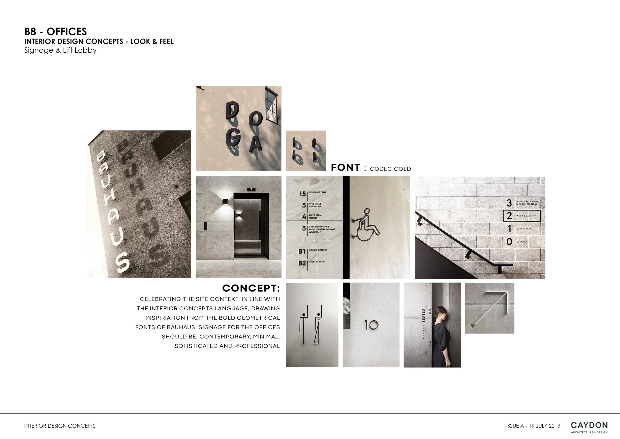
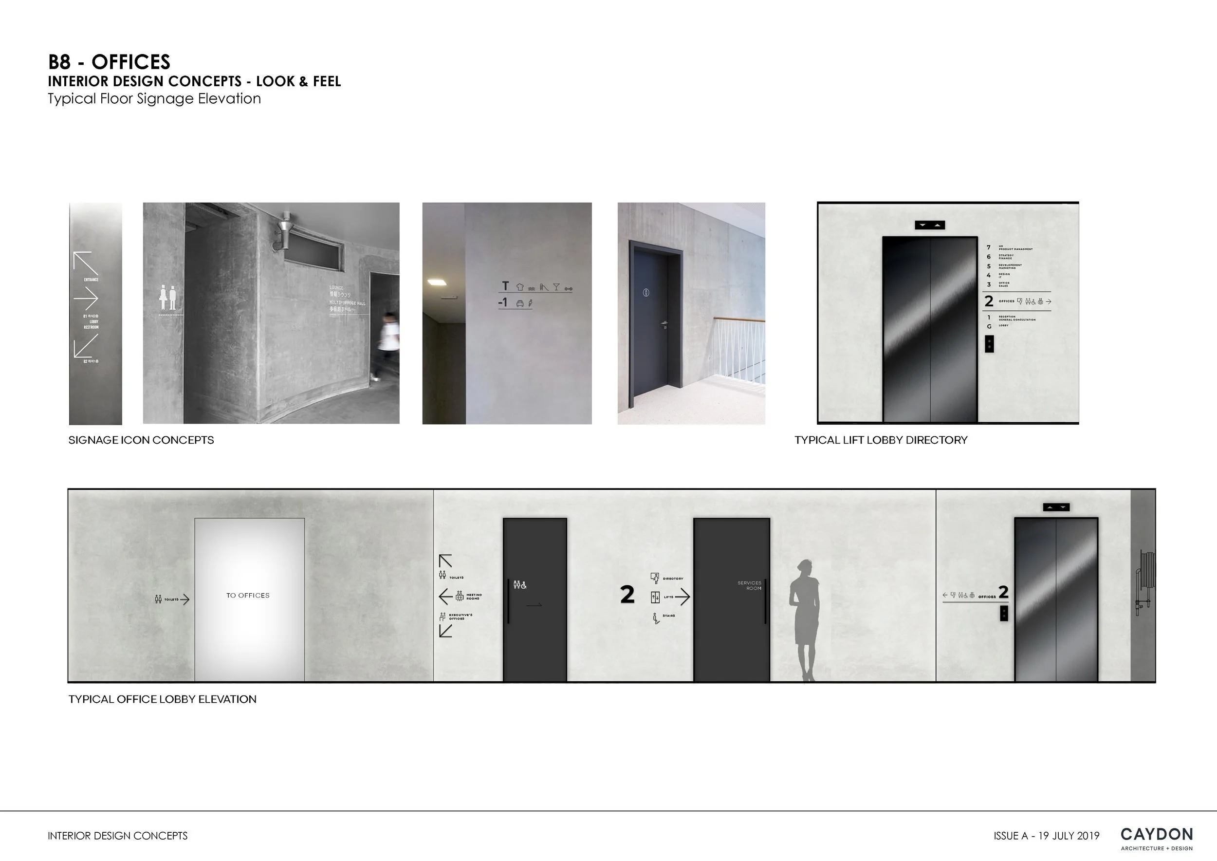
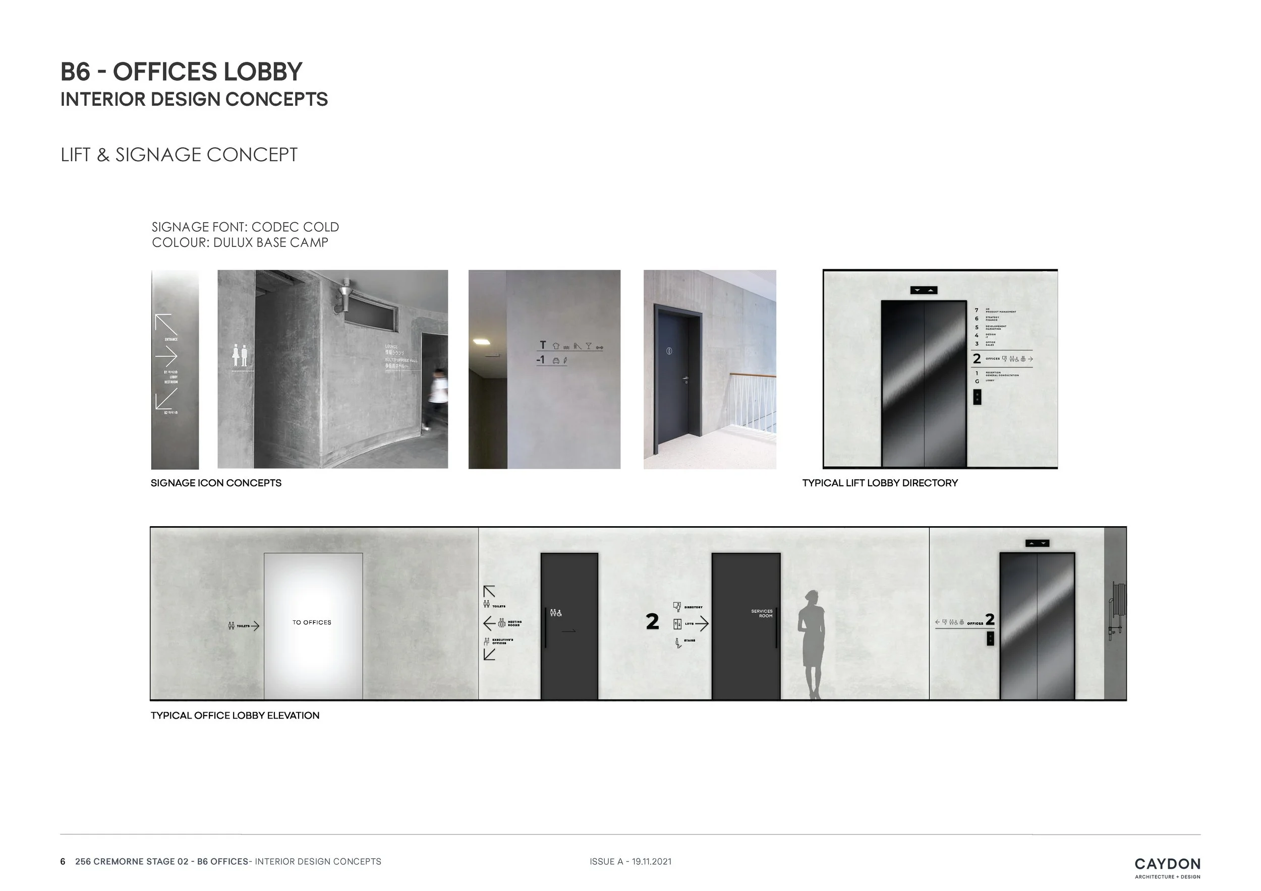
While designing the signage and wayfinding, I wanted to extend the identity of Coppins Corner, drawing directly from the industrial heritage of the precinct. A bold sans serif typeface, inspired by Bauhaus geometry, was selected to echo the varied Interior Design as the same signage will be used within the different building. Enlarged pictograms and oversized directional arrows provides clarity and ease of navigation while creating a strong visual presence on the raw concrete silo walls.